A translated brochure can read perfectly and still look broken. Words in German run longer than their English source, Arabic flows right to left, and a Japanese headline may need a different font entirely. Multilingual desktop publishing, usually shortened to DTP, is the step that makes translated material look as polished as the original.
Marketing teams often treat it as an afterthought. That is where launches slip, budgets stretch and printers send files back at the last minute.
What Multilingual DTP Actually Covers
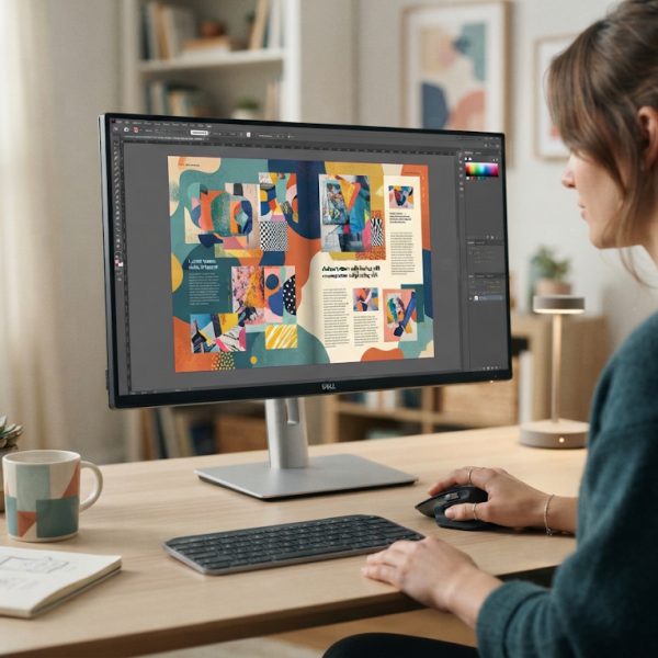
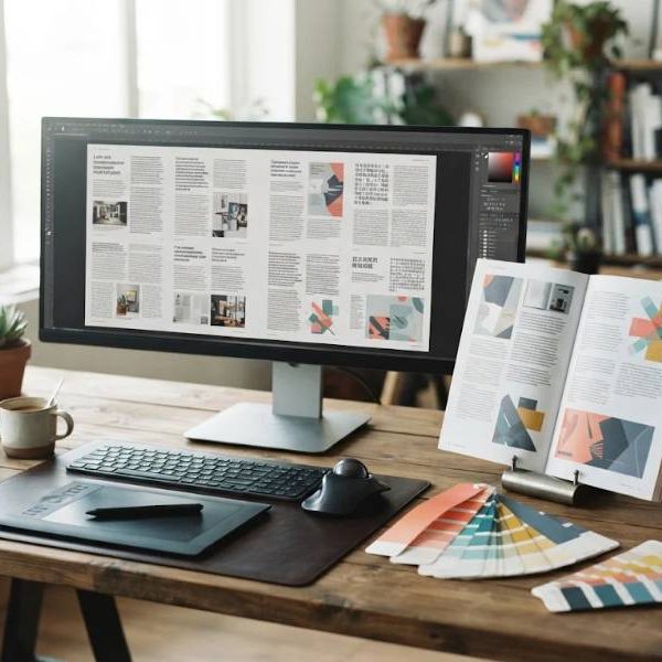
DTP means rebuilding a document so the translated text fits the design. A specialist reopens the source file in the original software, replaces the text, adjusts spacing and checks that nothing overlaps, spills over or disappears. The work applies to brochures, catalogues, manuals, presentations, packaging and interface screens.
It is different from translation, and it is different from graphic design. The DTP specialist protects the design that already exists and adapts it to the new language. That requires software skill and a basic understanding of how each script behaves on the page.
Why Text Expansion Breaks Layouts
Languages rarely take the same amount of space. English phrases often grow by 20 to 35 percent when they become French, Spanish or German. Chinese and Japanese can shrink the character count but may need larger type to stay readable.
A button that says "Buy now" in English can turn into a long compound in another language and push the whole row out of alignment. Designers who plan white space early save hours later. A good rule is to leave about a third more room in any box that holds text.
Fonts, Scripts and Direction
Not every font supports every alphabet. A typeface chosen for its clean Latin letters may show empty squares when it meets Cyrillic, Greek or Vietnamese diacritics. Standards such as Unicode exist so that characters from all scripts display consistently, but the font still has to include them.
Right to left languages, including Arabic and Hebrew, mirror the whole layout. Page numbers, images, tables and navigation move to the opposite side. Treating this as a simple text swap is the fastest way to produce a document that native readers find strange.
Images, Charts and Hidden Text
Text that sits inside images, charts and infographics is easy to forget. It needs to be extracted, translated and placed back, ideally from layered source files rather than flattened pictures. Alt text, captions and file names deserve the same attention, since they affect accessibility and search visibility.
Numbers, dates and currencies change format between markets. A date written 03/04 means March in one country and April in another. Catching these details at the DTP stage prevents confusion on printed material that cannot be corrected after distribution.
Labels and Regulated Content
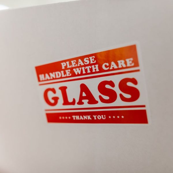
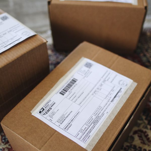
For physical products, layout and legal wording are linked. Safety warnings, importer details and usage instructions have to appear in the language of the sales market, in a readable size. If you sell consumer goods in the European Union, read this overview of GPSR labelling rules before finalising packaging artwork.
Packaging has the tightest limits of all, because every extra word competes with the brand, the barcode and the regulatory marks. Early planning between the translator and the designer pays off here more than anywhere else.
Working With a Translation Partner
The smoothest projects keep translation and DTP under one roof. The linguist can see the design, flag text that will not fit and suggest shorter wording before layout begins. A team handling French document translation services together with layout work avoids the usual back and forth between separate vendors.
Ask for a short checklist at the start. Which file formats are accepted? Are fonts supplied or substituted? Who approves the proofs? Clear answers prevent delays and unexpected invoices.
Quality Checks Before Anything Goes to Print
Proofing a translated layout is not the same as proofing the original. Check hyphenation, because automatic line breaks often split words badly in languages the software handles poorly. Look at widows, where a single word sits alone on a final line. Confirm that headers, footers and page references still point to the right places.
Finally, compare the translated file with the source side by side. Every image, table and call out in the original should have a counterpart in the new version. Missing elements are common and easy to overlook in a quick read.
A Practical Workflow
Begin with editable source files, not PDFs. Lock the copy before design adaptation starts, because late edits multiply costs. Send the translator a glossary and a style guide. Review a native-language proof, ideally by someone who did not translate the text, and approve the final file only after checking every page.
Plan for the longest language first. If a layout works in German, it will usually work in everything shorter. Build your templates around that rule and each new language becomes a routine task rather than a rescue mission.
The Bottom Line
Multilingual DTP is the quiet craft that decides whether translated materials look trustworthy. Budget for it, brief it early and treat it as part of the translation process rather than a final polish. Your readers will never notice good DTP, and that is exactly the point.