Open any well-made book, brochure or annual report and you probably will not notice the typesetting. That is rather the point. When the spacing, line breaks and margins are right, the eye glides down the page and the words do the work. When they are wrong, reading turns into a small, constant struggle that most people feel without being able to name it. Typesetting is the craft of arranging text so it is comfortable to read, and it matters far more than its low profile suggests, especially once a document has to exist in more than one language.
What typesetting actually means
Typesetting is the arrangement of type: choosing the typeface, setting the size, deciding the space between letters, words and lines, and controlling where each line and paragraph breaks. It sits between writing and printing. The author supplies the words and the designer supplies the pictures, but typesetting is the step that turns a raw manuscript into something a reader can move through without friction. Good typesetting is invisible. It manages rhythm, keeps the text from feeling cramped or loose, and stops awkward gaps and stray single words from breaking the flow. The term is a holdover from the days of metal type, when each character was a physical block a compositor placed by hand, yet the underlying goal has not changed at all.
Typesetting and desktop publishing are not quite the same
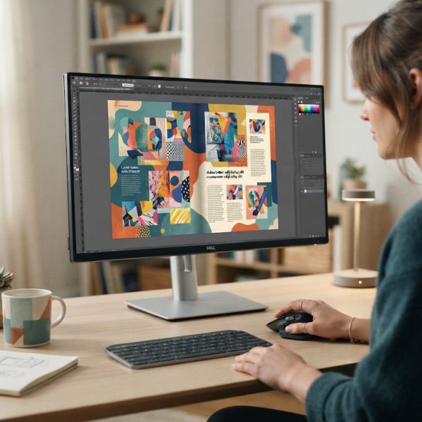
People often use typesetting and desktop publishing as if they mean the same thing, and the line has certainly blurred, but they are not identical. Desktop publishing is the broader activity of assembling a whole document on a computer: text, images, headings, captions and page furniture combined into a finished layout. So what is desktop publishing in practice? It is the modern workflow, usually built around software such as Adobe InDesign or its rivals, that a designer uses to lay out a magazine spread or a product manual. Typesetting is the more focused discipline within it that deals specifically with how the running text behaves. Plenty of desktop publishing software can place type on a page. Far less of it, and far fewer of the people using it, handle the fine typesetting decisions that make a long document pleasant rather than merely legible.
Why translation makes typesetting harder
A layout that works perfectly in English can fall apart the moment the text is translated, and this is where careful typesetting quietly earns its keep. Languages do not occupy the same amount of space. German and Finnish tend to run long, so a caption that fit neatly in English suddenly overflows its box. Chinese can run dramatically shorter, leaving gaps a designer has to rebalance, a problem PoliLingua examines in its piece on how translated text changes length between languages. Scripts behave differently too. Arabic and Hebrew read right to left, some writing systems need more line height to breathe, and a font that carries English beautifully may not even contain the characters another language requires. Handling all of this is a core part of content localization, and it is why adapting a document for a new market is never just a matter of swapping the words.
The small details that separate good from bad
The difference between competent and careful typesetting lives in details most readers never consciously register. Widows and orphans, those lonely single lines stranded at the top or bottom of a column, get pulled back into the fold. Hyphenation is set so words break sensibly. Spacing around punctuation is adjusted for the conventions of each language, since a French text, for instance, puts a space before a colon where English does not. As reference works on typesetting point out, these micro-decisions accumulate into the overall texture of a page. Ignore them and a document still functions, but it reads as slightly off, and readers tend to trust a sloppy-looking document a little less than a clean one.
Typesetting is the invisible craft that decides whether a page feels readable before anyone has processed a sentence. The same quiet work happens upstream in a good blog post template, where heading rhythm and paragraph length do most of the persuading. Readers rarely notice good structure, which is precisely how you know it is working.
Typesetting is invisible when done well and immediately obvious when done badly, which makes it a good analogy for adaptation generally. Layout carries meaning. Anyone weighing localization vs translation discovers that scripts with different text lengths break a design before they break a sentence.
When to bring in a specialist
For a short internal memo, the built-in tools in a word processor are fine. The calculus changes for anything public-facing or multilingual. A brochure going out in eight languages, a manual that has to match a strict brand guide, a report headed to print: these reward a specialist who understands both design and the quirks of each target language. Communities of designers, such as the r/typography forum on Reddit, are full of examples of layouts wrecked by a well-meaning amateur who let the software make every decision. The fix is rarely dramatic. It is usually someone who knows where to look, catches the overflowing box and the stranded word, and quietly makes the page read the way it should.
Typesetting will never be the part of a project anyone brags about. It is the invisible layer that decides whether a reader stays with your document or drifts away halfway down the page. In a single language that is worth getting right. Across several, it is the difference between a translation that looks native and one that plainly looks translated.